Hello,
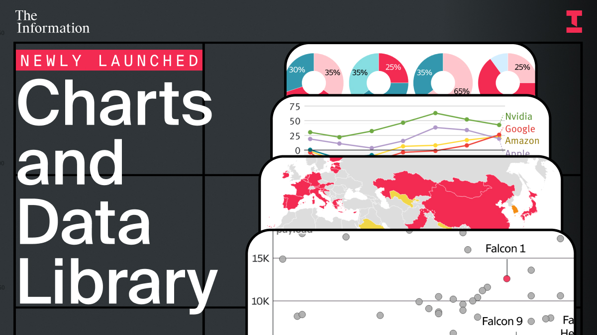
We recently launched a a searchable archive of every chart, diagram and data visual published in The Information's reporting. To show how it works — and why it matters — here are a few of the charts that illustrate the shifts shaping tech.
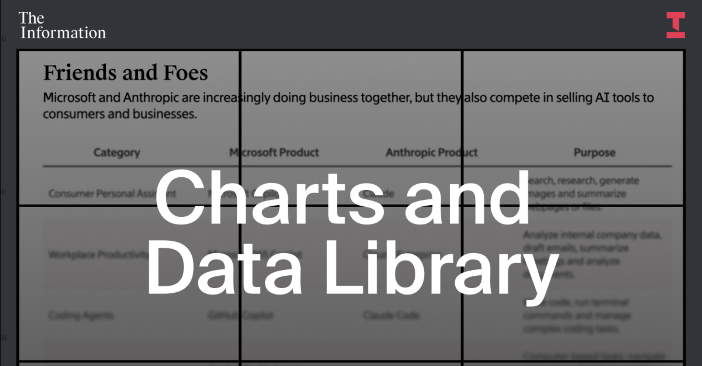
Microsoft and Anthropic: Friends and Foes
This chart maps how Microsoft and Anthropic increasingly overlap across AI products — from consumer assistants to enterprise tools, coding agents and model hosting. It shows where the two companies partner, where they compete and how blurred the lines between the biggest AI players have become.
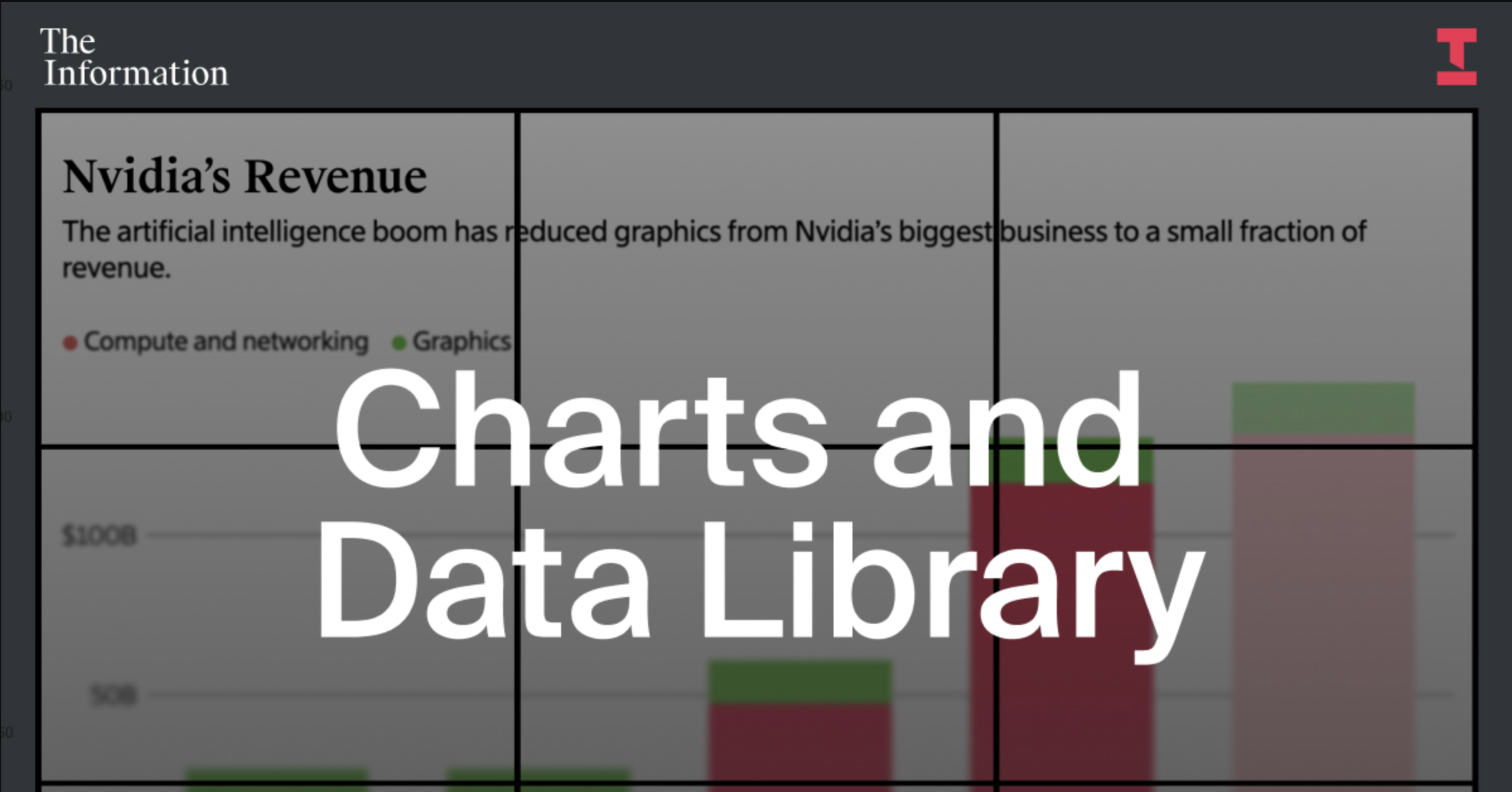
How AI Remade Nvidia's Business
This chart breaks down Nvidia's revenue by business line over time. It shows how graphics went from Nvidia's core business to a small fraction of revenue — replaced by explosive growth in compute and networking tied to AI chips.
Each chart lives on its own page, and is linked directly to the reporting behind it — making it easier to move from data to insight.
To mark the launch of the charts archive, new subscribers can subscribe for $399 $299 and save 25% on an Annual subscription for the first year of The Information.
If you rely on data to understand where technology and business are headed, this library is designed for you.


0 comentários:
Postar um comentário